Spreadsheet applications allow quick and easy creation of many different types of graph and chart, including pie charts and bar graphs.
Graphs and charts can be customised in a huge number of ways, but ensure the colours and style match the design and colour scheme of the rest of your project.
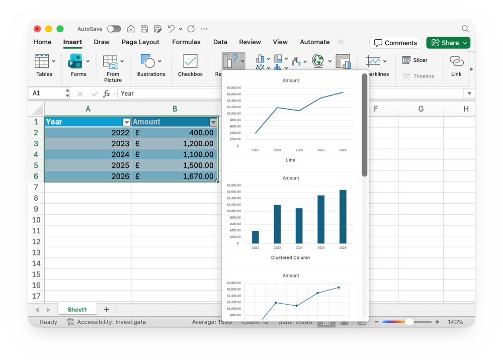
Creating a Line Graph
A line chart is a good way to show changes over time (e.g. sales each year). They can help to identify trends and patterns.
- Format your data as a table. Your columns should relate to the X and Y axis on the graph.
- Select the data in the table
- Click the Insert tab, then choose the type of graph you want. The Recommended Charts menu is a good place to start
- The graph will be created
- You can move the graph to wherever you want on your Sheet
- To edit colours, text, or any other individual element on the graph, double-click it
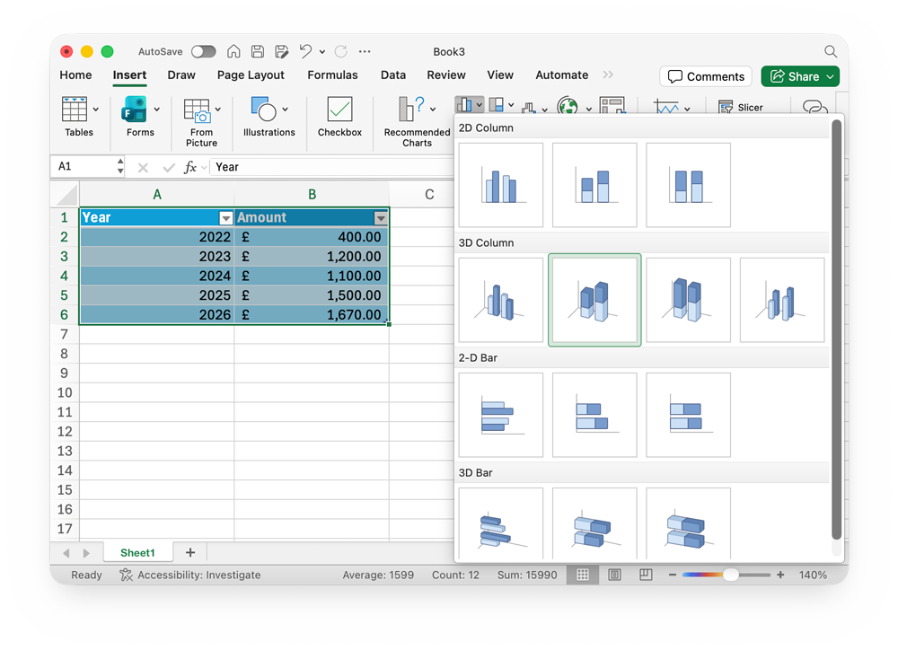
Creating a Bar Graph
Bar graphs are used to compare different categories (e.g. sales of different products). They makes it easy to see which is biggest or smallest.
To create a bar graph, follow the same steps as for a line graph, but choose a bar graph instead of a line graph.
To edit colours, text, or any other individual element on the graph, double-click it
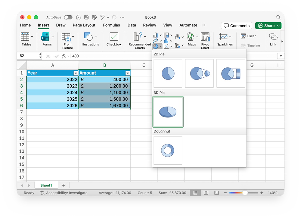
Creating a Pie Chart
Pie charts are used to show proportions of a whole (e.g. market share). They help you see how each part contributes to the total.
- Format your data as a table.
- Select just one column of data – the one you want to create your chart from
- Click the Insert tab, then choose the type of graph you want. Choose the style of pie chart you want
- The graph will be created
- You can move the graph to wherever you want on your Sheet
- To edit colours, text, or any other individual element on the graph, double-click it